
Remi Road - logo design
drawing inspiration from the desert, cattle ranches and the open road, this logo for a media production and consulting company based out of southern california is designed with intention, versatility and practical use in mind

moodboard, sketches and pantone color palette inspired by the open road
yellow is used on roads for its high contrast and visibility, this particular shade works well on both light and dark backgrounds


design concepts and evolution

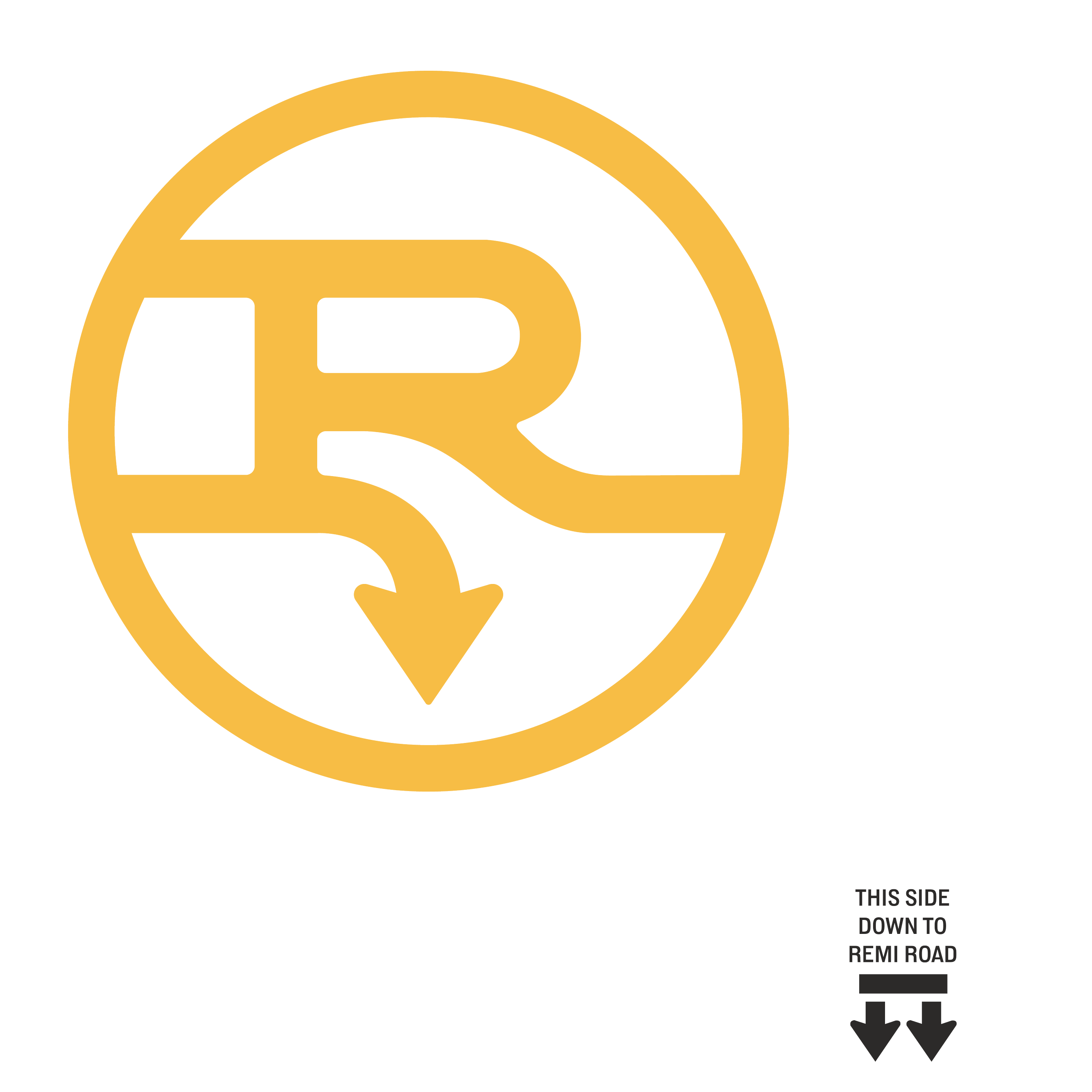
finalized brandmark
a lower case r / road sign arrow rests face down below a strong capital R
in traditional cattle branding, a letter on its side translates to mean lazy
this represents the duality of remi (the client’s pup), sometimes lazy but actually very athletic
the downwards arrow helps to solidify the downwards theme
works well with or without a container, small or large scale, any combination of colorways or black on white or white on black, transparency over images, visually balanced and aligns well with the brand values: modern, connected, efficient, nimble, collaborative and inclusive

simple brandmark
inverse brandmark
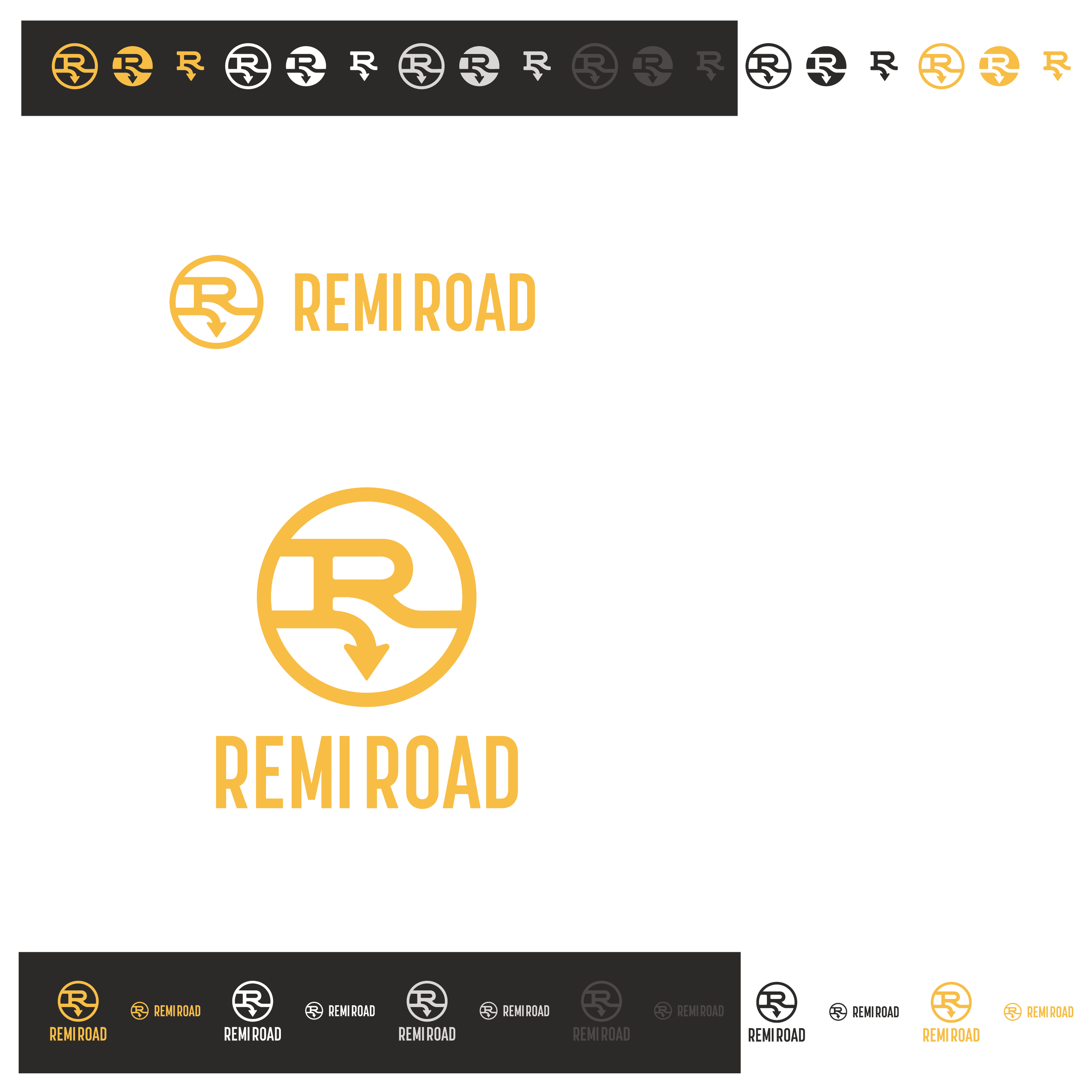
main logo hornizontal
main logo stack
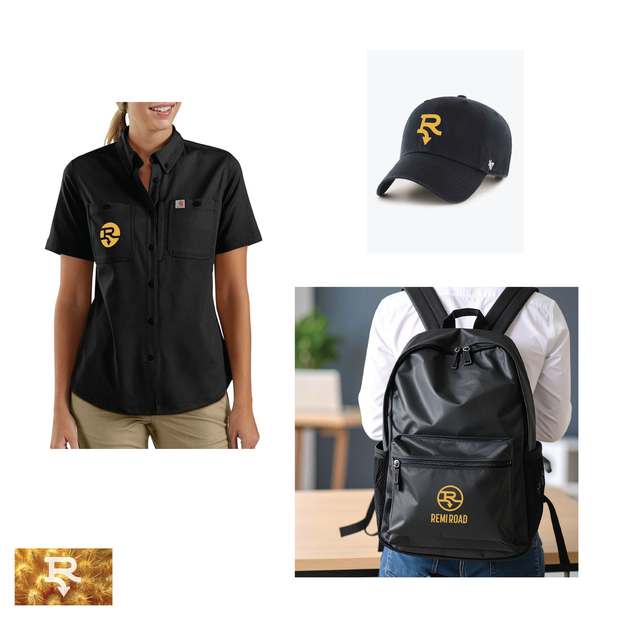
practical mockups